|
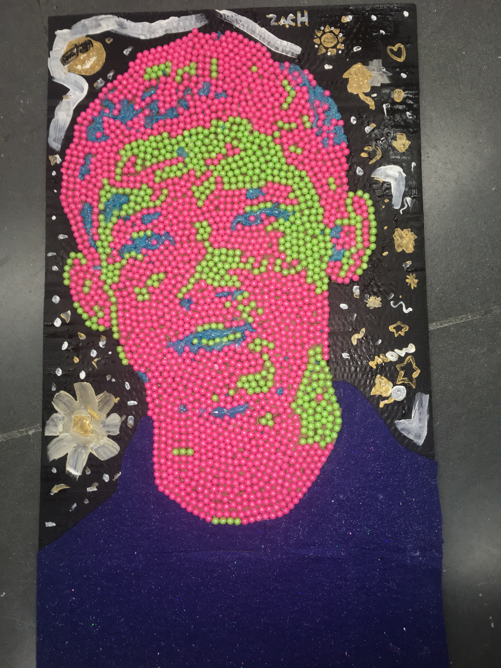
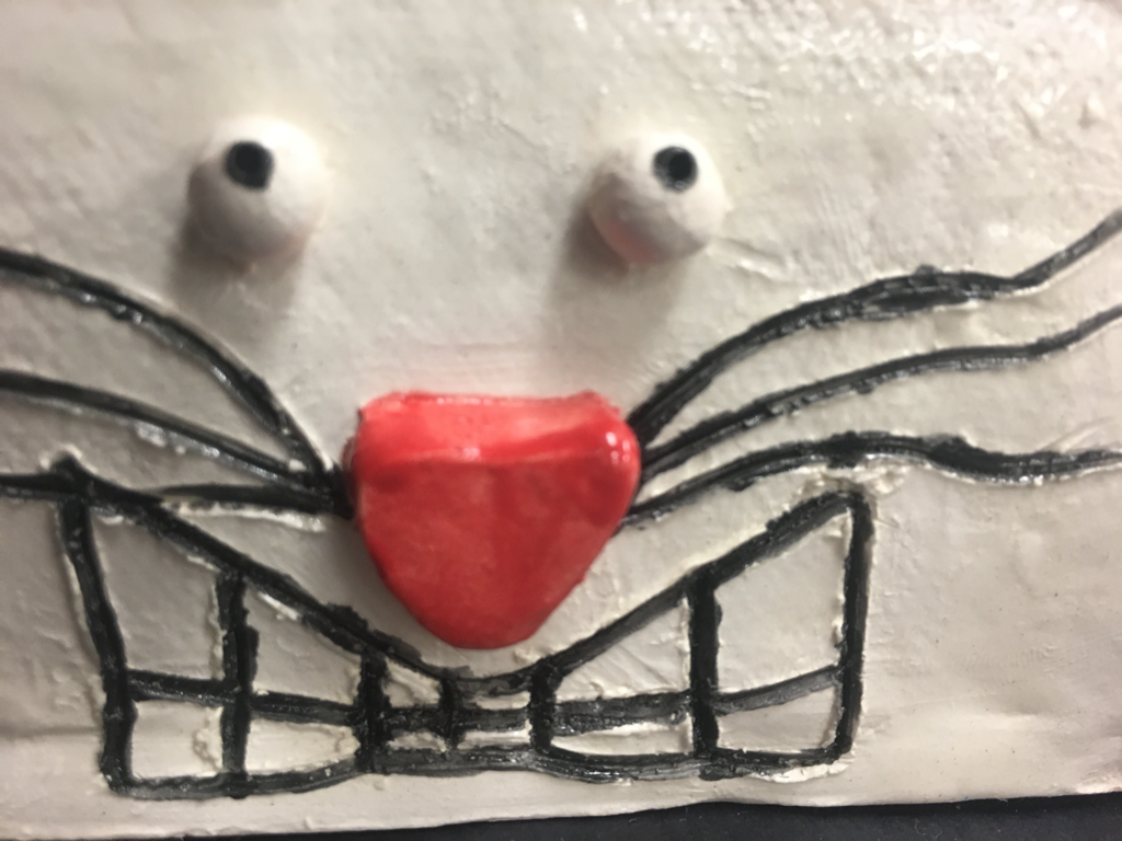
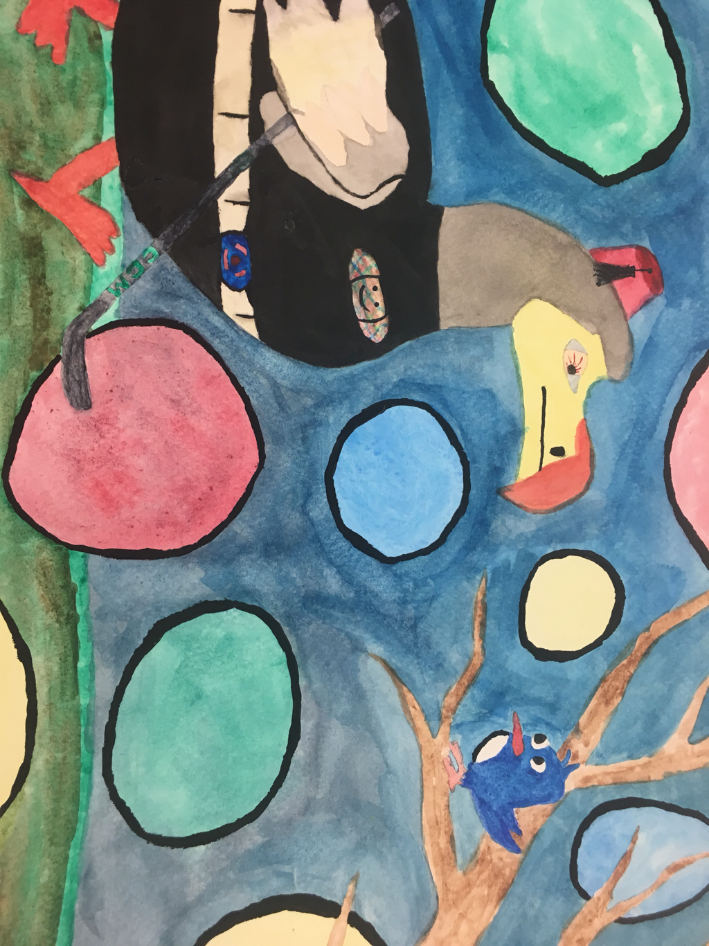
Art criticism process: Describe the artwork: List what you see in the artwork. How would you describe it over the phone? Analyze the artwork: List art elements and design principles. Color, value, line, shape, texture, space, balence, emphasis, harmony, variety, movement rythm, proportion Interpret the artwork: What is the mood? What is the story being told? Judge the artwork: What do you think of the artwork? Is it successfully? Why or why not? Critiqe: Describe: I see my friend Zach’s face made with weird beads, felt, and what looks like melted sprinkles. It has a very bumpy texture and is made with exciting colors. Analyze: I see a nice contrast in color. There are a lot of curvy lines all around the piece but no really straight lines and the shapes seem rather random throughout the kids face. The texture looks and feels bumpy yet satisfying. The space in the background seems a bit dull. Adding a background would help this piece. Interpret: I think the mood of this is a bit happy since he is smiling but there isn’t really a story being told. It’s just a portrait of a teenager smiling at the camera. Judge: I think it’s successful but it could definitely use a background. I think it’s just a face and looks a bit plain and dull. I think adding a background would make the face pop out a bit more and make the piece overall look better. (picture below)  13. I think the most difficult part of this class was coming up with ideas on what to work with and coming up with the actual idea for me piece. In the future I think I will think of few ideas to start of and thoroughly plan out what I’m gonna do for my piece. 9. I don’t really think it helped me too much. I think it helped my drawing a tiny bit but not enough for me to want to keep drawing them since it didn’t help much. 4. Artists make art for many reasons. They make art to show emotions, for their pleasure, for others pleasure, on accident or just because they are bored and have nothing left to do. These are just a few examples but artists make art all of the time and they have hundreds of reasons for it. 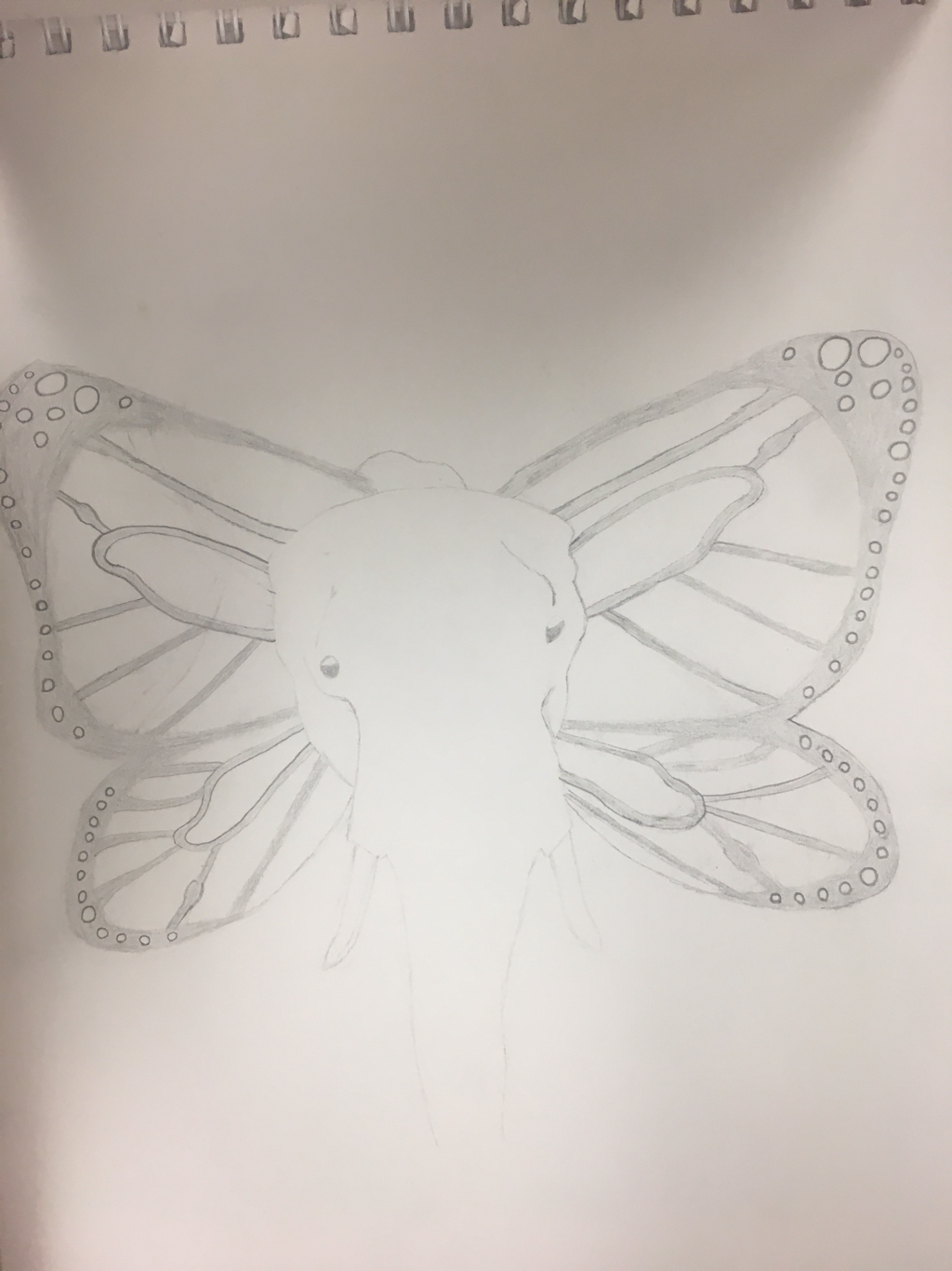   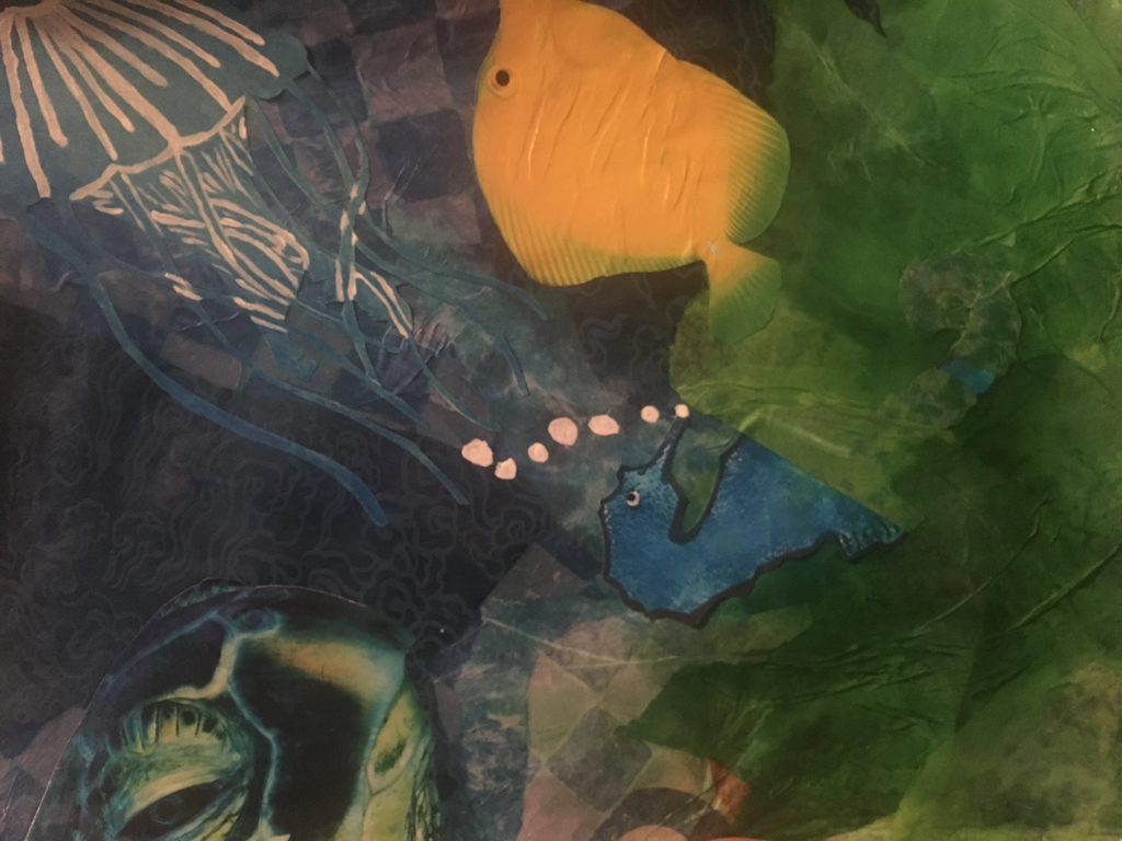 I used 5 different mediums, paint, linocuts, tissue paper, cuting from magazines, gel, and glue. I used the gel and glue to get down the tissue paper, cutouts and the linocuts. The paint was just to add a bit of detail to a few things My word was ocean so I create an underwater scene.
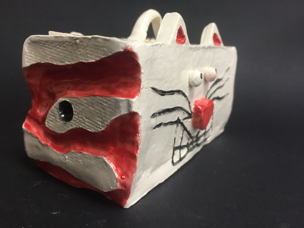 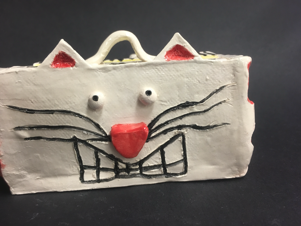  Since then I had to fire my piece in the kiln so I would be able to glaze it to make it look like it does now. Then I had to fire it again so the glaze would dry and look shiny. I think the most successful thing is the fact that’s it’s just an awkward cat turned into a box. If I was to do this again I think I would add more layers of glaze, maybe take more time on the sides and add something to the back.
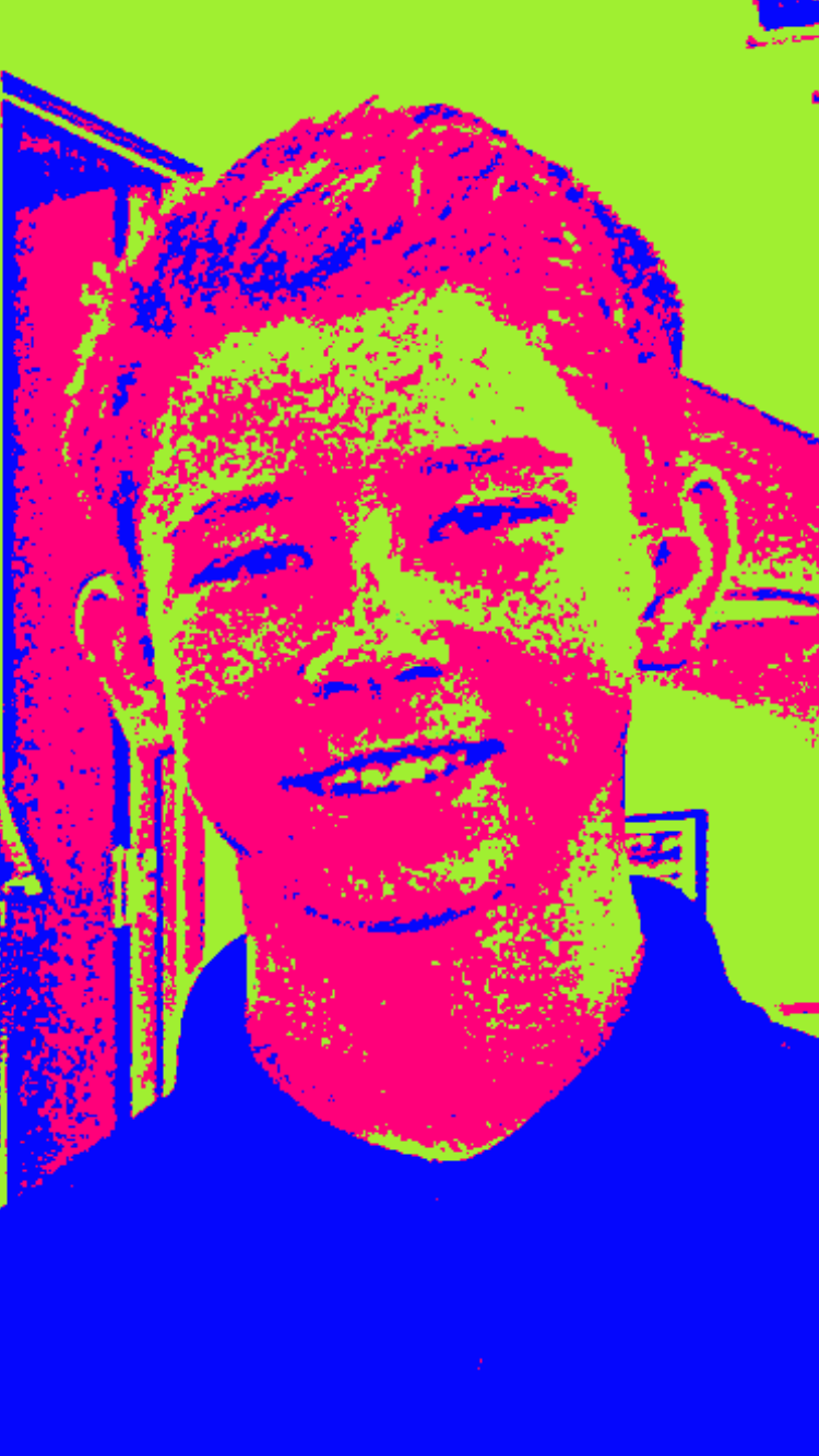 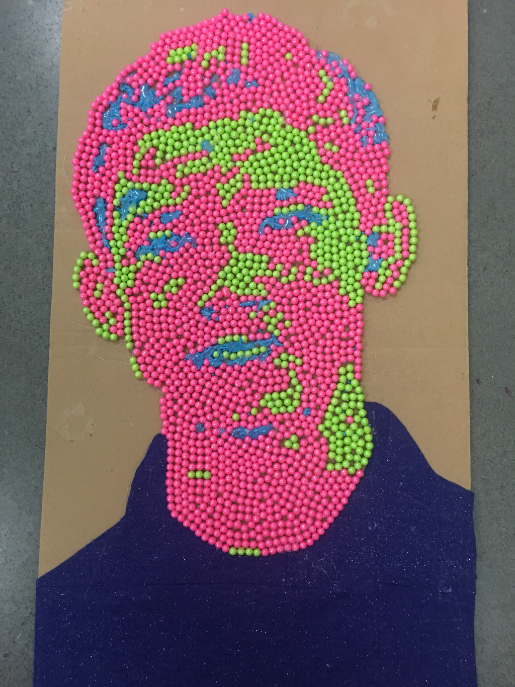 I did a portrait of my best friend Zach. I used some weird candy, sprinkles and felt as my medium. I started off drawing him onto the cardboard and labeling the colors so I would know where to put each candy. Next I took hot glue and glued on the candy. I think it was overall pretty successful but I think I might work on a background for it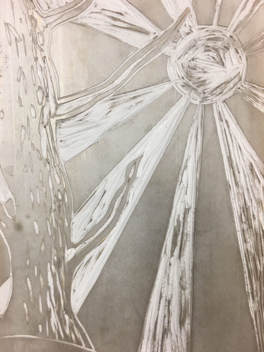 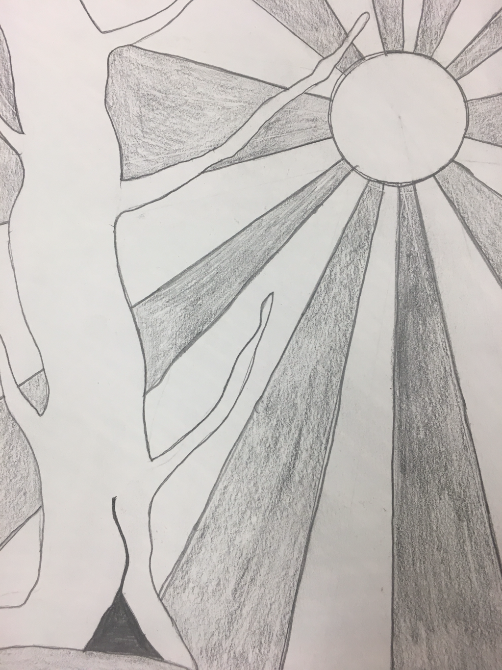 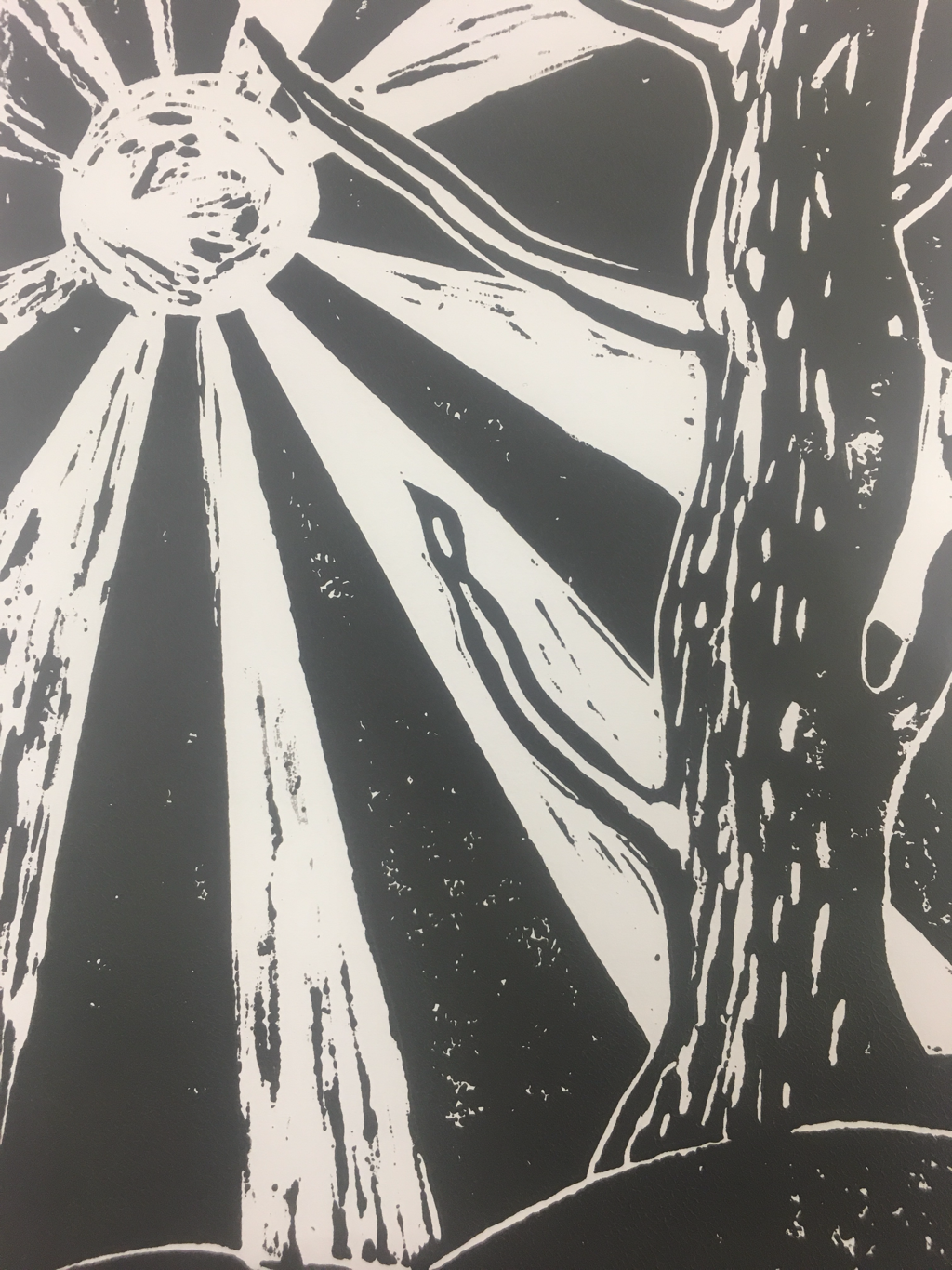 I think the rays from the sun showed off the theme of line for my piece. I think the black and white made my piece successful. If I were to do this again I think I would make my cuts more clear so no black would show up on the white parts. I also think I would “shade” the tree more so it looks more round.
  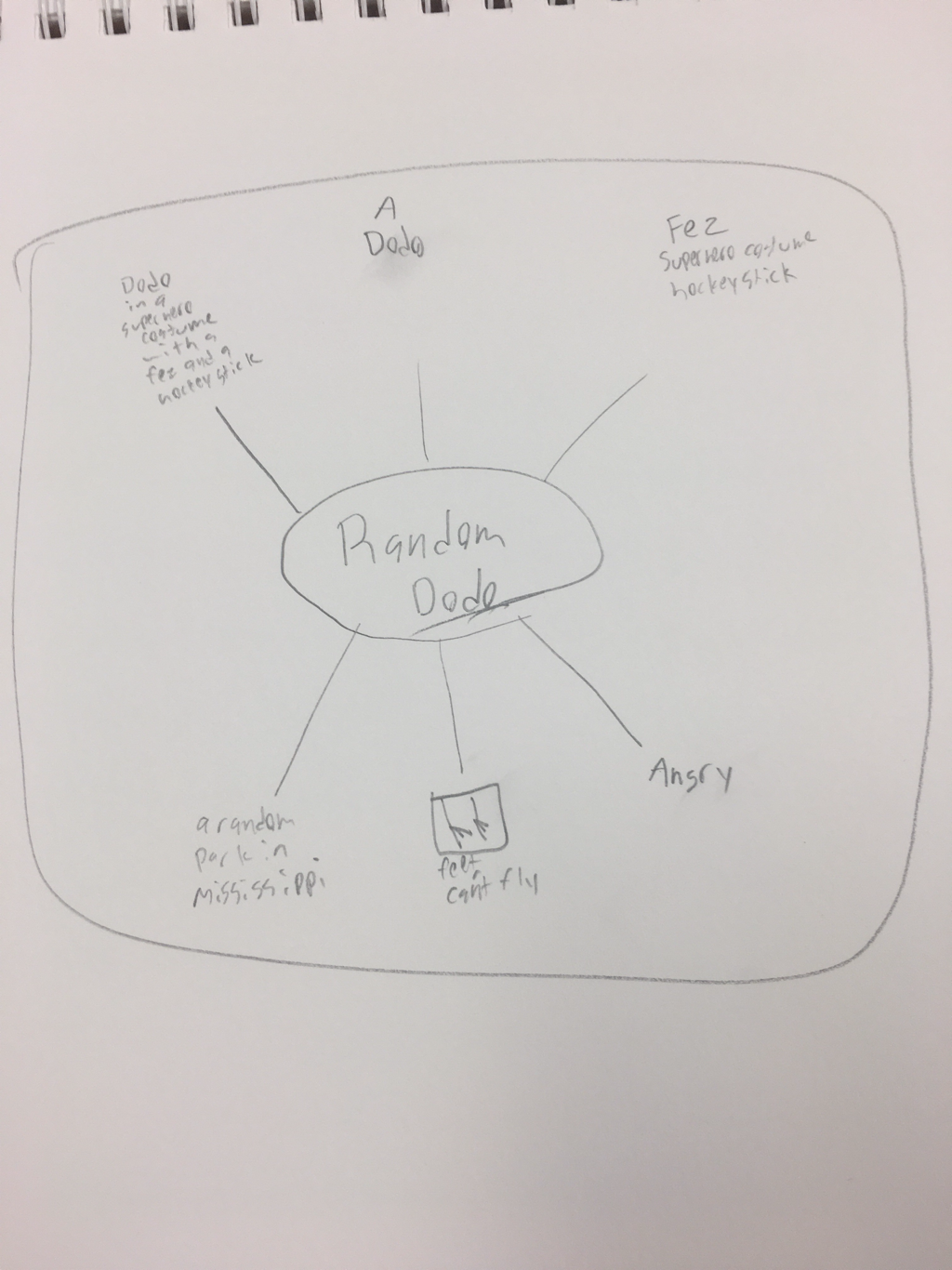 I created my own character. My advice would be to take it slow and make sure colors next to each other don’t blend and ruin your piece
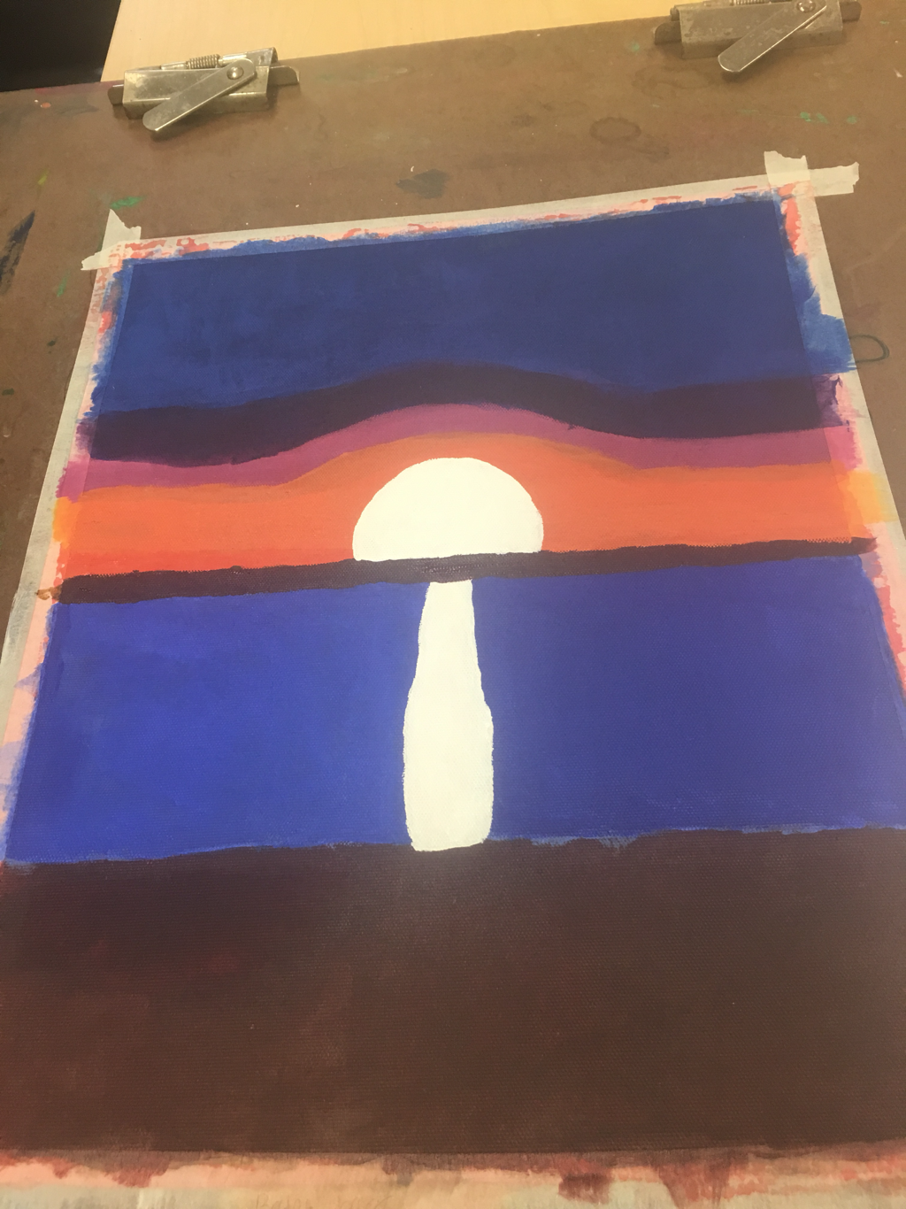   The place represented in my picture is a sunset from my hometown Pittsburgh PA. The most challenging part was the fading in the sky. I think the most successful part of my painting was the reflection of the sunset in the water. I started of by getting the base colors down for the background. Then I went in and blended them together. After that I went in and did the water and added the reflection of the sunset into the water
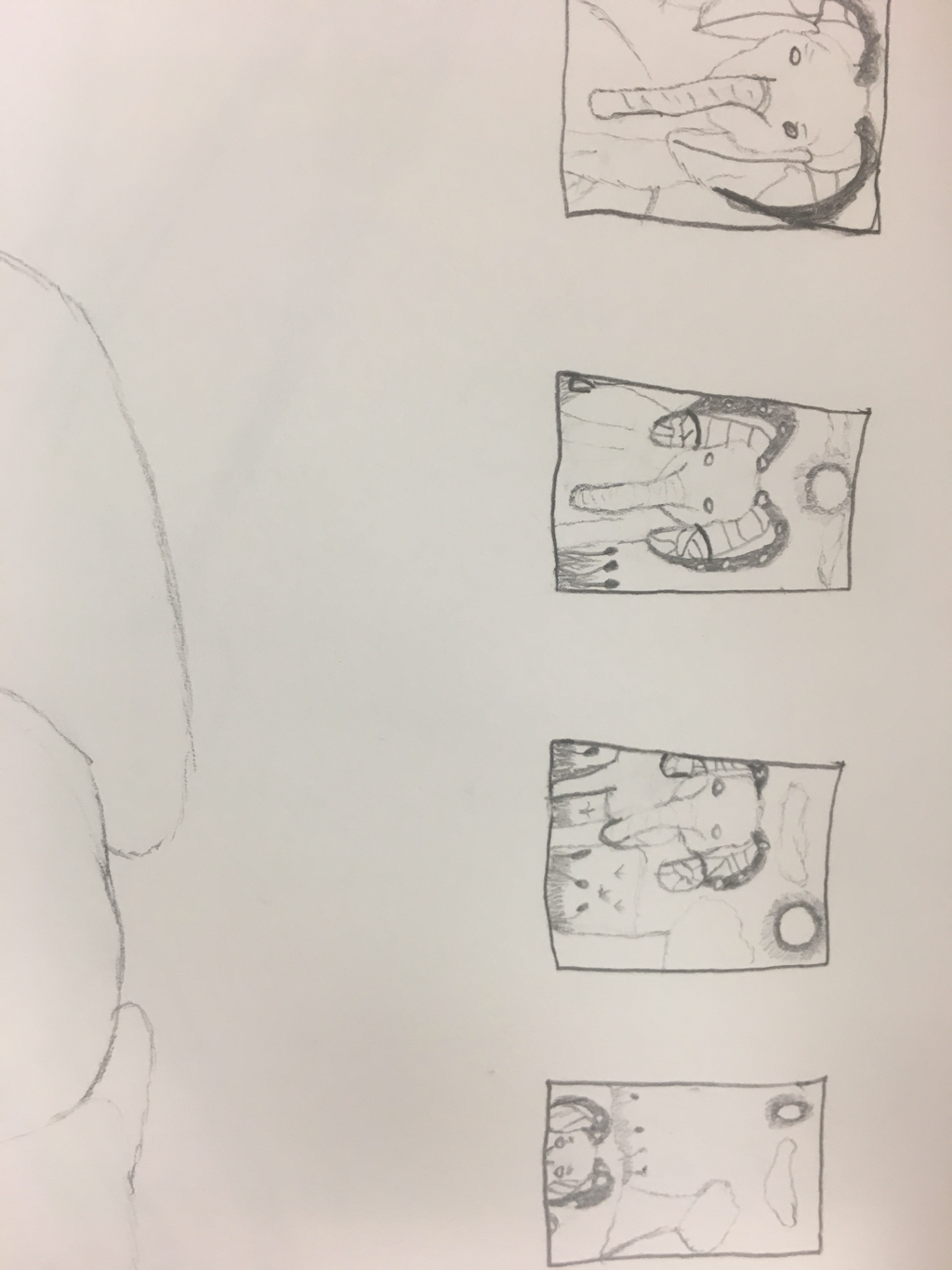 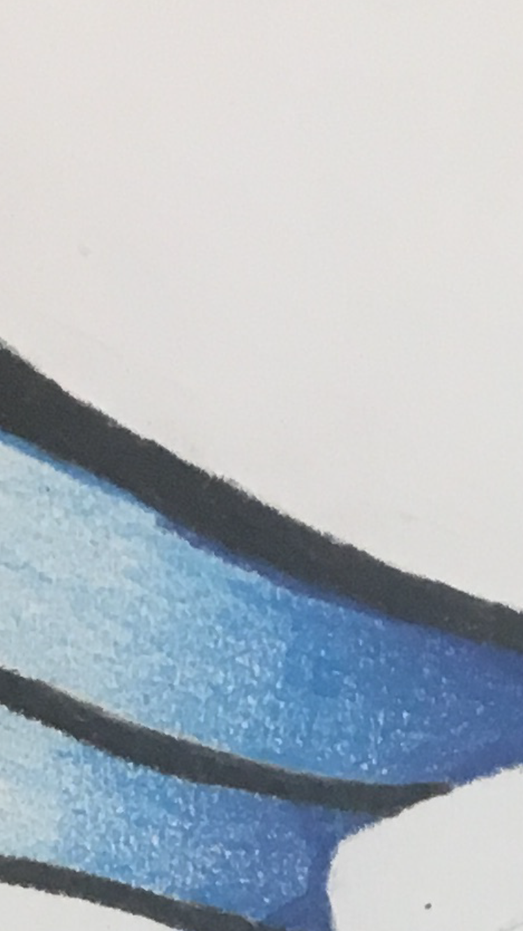 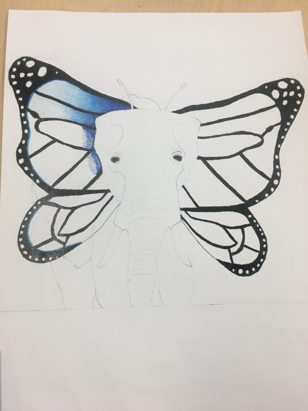 I chose pencil and colored pencil for my medium. I chose this because I love the way that the blending looks once it’s all placed together. I combined a butterfly and an elephant for my project. I started off with getting a rough sketch of my piece and then going back in and filling in the details. I then went in with black to fill in the dark spots and used light colors to make it pop out more
|